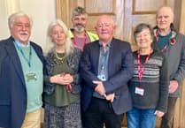
GUEST demonstrator at the most recent meeting of Newton St Cyres Art Club was local artist and art teacher Tony Homer.
Tony's talk was titled "Working from Sketchbooks" and he recommends daily sketching to improve drawing skills.
He uses cartridge paper sketchbooks, which can be used in a portrait or landscape orientation and can lie flat to allow for double page sketching.
To avoid any erasing he normally sketches using a permanent 0.3 fineliner.
His resulting sketchbooks predominately consist of black and white line drawings, but he occasionally touches up with colour when back at his studio.
When creating his artwork, he merges pleasing elements of different sketches to produce his composition, drawing, excuse the pun, inspiration from Cubism and artists such as Picasso, Mondrian, Terry Frost and Ben Nicholson.
This was demonstrated with two urban landscapes.
Tony often works on two paintings at a time, as moving from one to the other allows him to work with "fresh-eyes".
Strong architectural structures were quickly and simply sketched out using a 5b graphite pencil on mount board, with figures and text, such as shop signs, included to provide scale.
The mount board was wetted, then he used Matt Medium to dilute the acrylic; this does not reduce the intensity and avoids the "dulling" effect of white.
Stripes of bright orange and ultramarine were boldly applied using flat brushes in a grid fashion and allowed to soften on the damp board.
Tony favours bright colour combinations and complementary colours.
He continued to work using "cheap" flat brushes to block in the buildings and figures using a limited palette.
He took care to ensure, for pictorial accuracy, that the foreground stood out more by employing sharper lines, more detailing and stronger colours.
The distortions and reflections in windows and shop fronts were also captured. He enjoys fragmenting and breaking images and exploring "the split" between reality and abstraction.
A credit card was used to apply the paint, in places, to provide sharper lines, but Tony encouraged us to not over do this. The text was blocked around rather than painted in, as he believes this to be more effective.
The resulting artworks were fresh, vibrant and atmospheric.
Nicola Hussey


Comments
This article has no comments yet. Be the first to leave a comment.